In system theory, a Bode plot consists of two separate plots of the system’s gain in decibels (dB) versus ; and of the system’s phase (in degrees) against . This visually depicts the system’s frequency response.
These plots are used to assess the performance of continuous-time systems, like analogue circuits and control systems.
Basics
Given a transfer function, we want to rewrite it into a “Bode form” that makes it easier for us to draw both gain and phase plots. We want each pole to take the form:
where and is a given frequency. For example, for a transfer function, the Bode form looks like:
Note that we take out the constant term. This makes our analysis easier since we can easily identify the plot’s corner frequency.
For each term in the transfer function, we draw out a separate Bode curve. Then, the contributions are superimposed on top of each other (i.e., we take the algebraic sum of all the contributions) to get a final Bode plot for the whole system. Why is this? We can take the logarithm of : by logarithmic properties multiplication becomes addition and division becomes subtraction.
What this means is that we should build multiple different plots, then combine them together.
When we’re drawing Bode plots by hand, it suffices to have an approximation of the system’s frequency response. With a straight-line approximation, we can approximate the system as the sum of multiple straight lines.
Gain plot
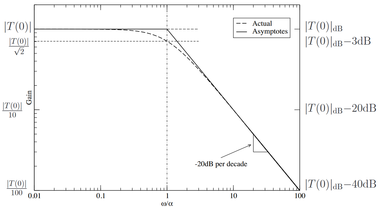
A first-order low-pass gain plot is given by the below. This means the Bode plots for our systems should be the sums of smaller plots that look like these:
 We can refer to this chart when drawing gain plots ( is the numerator, is the denominator):
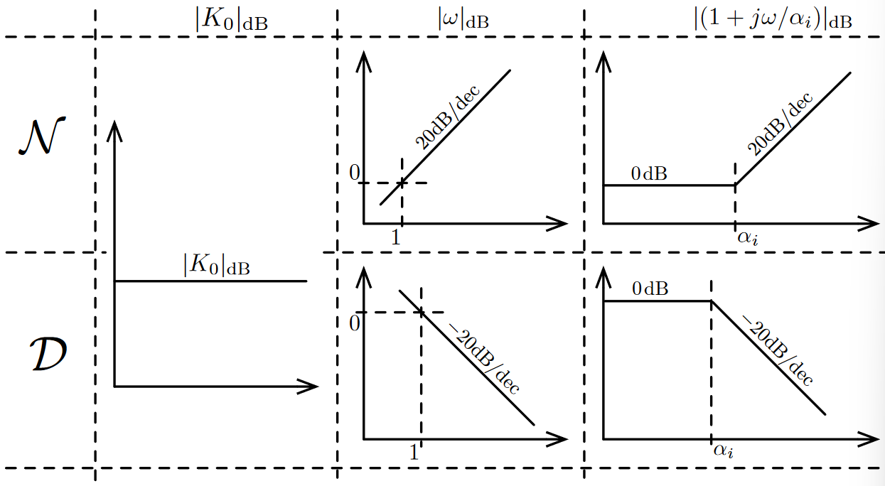 The point(s) where the plot crosses the 0 dB point is called the crossover frequency .
Some observations:
- The 20 dB per decade is mainly a result of the decibel scaling (). If our poles/zeros are duplicated (i.e., ) then we get 40 dB per decade. This scales as we continue.
- There’s a pole at the corner frequency, which results in the corner of the plot. In practice, the gain is around 3 dB less than the usual flat gain to the left of the corner.
- This straight line approximation allows us to roughly draw the Bode plot only with straight lines. The 3 dB point is at . At , we’re roughly at 1 dB. Then, we can say to the left of we’re at 0 dB.
Phase plot
The first-order phase function is given by:
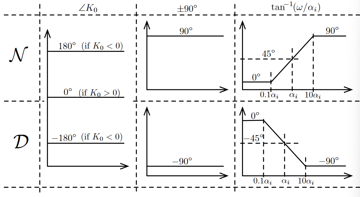
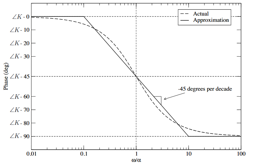 We can refer to this plot when drawing phase contributions:
Interpretation
Bode plots are used in control theory to assess the stability of a system, via the gain and phase margins. The core idea:
- If the gain is 1, we have an unstable system. To compute the phase margin, we find the point where the gain plot intersects 0, i.e., .
- If the phase is , then we have an unstable system. To compute the gain margin, we find the point where the phase plot intersects .